Dynasty Meets the Central Limit Theorem
There’s a classic probability problem/brainteaser popularized by google that states:
In a country in which people only want boys, every family continues to have children until they have a boy. If they have a girl, they have another child. If they have a boy, they stop. What is the proportion of boys to girls in the country?
It seems reasonable that such a country would succeed in their goal of skewing the population demographics. However, google’s solution to the brainteaser goes on to justify how the population will still end up 50% male/50% female.
Interestingly enough, google’s “official” solution of 50%/50% is incorrect, depending on how you interpret their wording. Assuming that they’re asking for:
(what’s the expected ratio of boys to girls?) there’s a problem with their reasoning. That’s not the only twist. While for a large enough population their answer is very close to correct, for any one family the expected percentage of boys is closer to 70%.
The crux of the issue stems from an invalid application of the expectation operator. We’re interested in the random variable , where is fixed and is itself a random variable: the total number of children in the population. Note that because each family has exactly one boy, is both the number of families and the number of boys. If we assume that boys and girls are born with , the expected number of children that any one family will have before producing a boy (inclusive) is given by the geometric distribution with :
From there, it seems reasonable to assume (as the google argument does) that:
However, expectation only commutes with linear operators, so the equality above does not hold. Taking things one step further we can find a bound showing that ratio is greater than 1/2 for all finite populations. Jensen’s inequality (the Swiss Army Knife of mathematical sanity checks) gives that for a non-degenerate probability distribution and a convex function , . Letting gives:
One of the most interesting things to come out of this analysis is the observation that the expected ratio of boys to girls in one family is a biased estimator of the population mean. To understand why, remember that 50% of the time we’ll observe a family with one child (a boy, making for a ratio of 100% boys), and 50% of the time we’ll observe a family with at least one girl. Working with ratios instead of sums underweights the contribution coming from families with at least one girl. Individual families will, on average, produce a ratio of boys to girls close to 70%. However, as families can have at most one boy and potentially many girls, the population ratio will approach 50% from above.
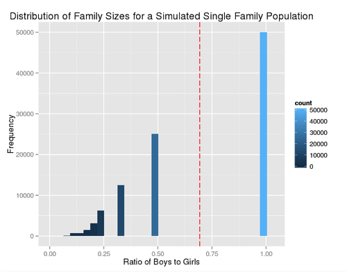
We can calculate the single family distribution empirically or explicitly. Here’s what it looks like:
# Simulates a single family instance in which the parents will have continue
# to have kids until a boy is born. The probability of a boy and a girl is
# taken as .5.
sim.family <- function() {
	# R hates loops, so let's use a tail recrusive call to a vectorized
	# function for performance reasons.
	sim.count <- 10
	sim.family <- function(n) {
		# Conduct sim.count Bernoulli trials and see when the first heads
		# (a boy comes up). If there aren't any boys in our vector, recurse,
		# adding sim.count to the total number of kids in our simulated
		# family.
		result <- which(as.logical(rbinom(sim.count, 1, .5)))
		if(length(result) > 0)
		{
			return(n + result[1])
		} else {
			return(sim.family(n + sim.count))
		}
	}
	return(sim.family(0))
}

# Simulates n populations of k individuals
sim.population <- function(n, k) {
	matrix(nrow = n, ncol = k, data = apply(as.matrix(1:(n * k)), 1,
		function(x) { sim.family() }))
}

# Computes the mean ratio of boys to girls for a simulated population.
population.stats <- function(x) {
	mu.vec <- dim(x)[2] / apply(x, 1, sum)
	return(mean(mu.vec))
}

single.sample <- sim.population(100000, 1)
df <- data.frame(Ratio = 1 / single.sample)

ggplot(df, aes(x = Ratio, fill = ..count..)) +
	geom_histogram() +
	geom_vline(xintercept = mean(df$Ratio), color = "red", linetype = "longdash") +
	theme(plot.background = element_rect(fill = '#F1F1F1'),
	legend.background = element_rect(fill = '#F1F1F1')) +
	xlab("Ratio of Boys to Girls") +
	ylab("Frequency") +
	ggtitle("Distribution of Family Sizes for a Simulated Single Family Population")

The red dashed line denotes the mean value—.69 for my run of the simulation. Using the same set of sample data and treating it as one simulated population of 100,000 instead of 100,000 simulated populations of one family:
cat(sprintf("Population mean: %.2f\n",
	dim(single.sample)[1] / sum(single.sample)))
gives “Population mean: 0.50.” To see why the population will tend towards 50% we’ll need to appeal to the Central Limit Theorem (CLT). For a rigorous explanation of the math see the excellent post by Ben Golub here. In short, by the CLT, as the number of families becomes large, the total number of children in the population will tend towards . We’ll have boys for our children, leading to a ratio of with tight error bounds given by the CLT.
The applicability of the CLT depends, loosely speaking, on “how poorly behaved” the distribution that you’re sampling from is, and the size of your sample. Lucky for us, the geometric distribution is well behaved (finite variance and mean —both assumptions of the CLT), and our samples are definitely independent. We’re not always that lucky though—some fat tailed distribution such as the Cauchy distribution for which neither mean nor variance is defined can prove problematic.
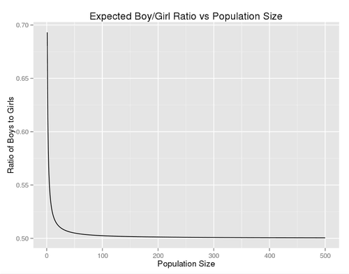
So how well does the CLT handle our family planning problem? The expected ratio of boys to girls for a population of individuals is given by:
where is the Digamma function (the derivation is here). Plotting this function we see that it rapidly converges to a ratio of .5:

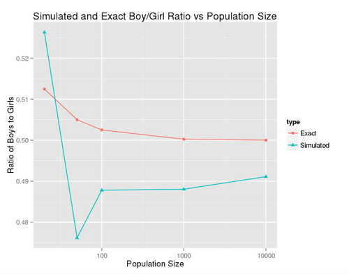
We can run a quick simulation to confirm our results:
pop.size <- c(20, 50, 100, 1000, 10000)
results <- NULL
for(k in pop.size)
{
	results <- c(results, population.stats(sim.population(1, k)))
}

pop.size.count <- length(pop.size)
df <- data.frame(
	type = factor(c(rep("Exact", pop.size.count),
		rep("Simulated", pop.size.count)), levels = c("Exact", "Simulated")),
	mean = c(prop.boys(pop.size), results),
	k = rep(pop.size, 2)
)

ggplot(df, aes(x = k, y = mean, shape = type, color = type)) +
geom_line() +
geom_point() +
theme(plot.background = element_rect(fill = '#F1F1F1'),
	legend.background = element_rect(fill = '#F1F1F1')) +
	scale_x_log10("Population Size") +
	ylab("Ratio of Boys to Girls") +
	ggtitle("Simulated and Exact Boy/Girl Ratio vs Population Size")

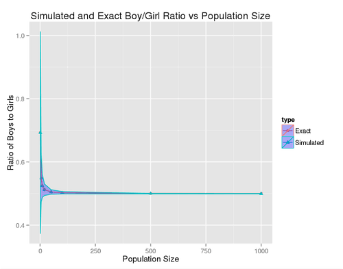
We see that our simulations are within a few percent of the theoretical and converge towards the true value as becomes large. So far we’re only looking at one simulated population. How do our results look if we average across many simulated populations?
# Computes the mean ratio of boys to girls for a simulated population as a
# vector in the form (mean, sd).
population.stats <- function(x) {
	mu.vec <- dim(x)[2] / apply(x, 1, sum)
	return(c(mean(mu.vec), sd(mu.vec)))
}

samples <- 1000000
pop.size <- c(1, 5, 10, 20, 50, 100, 500, 1000)

results <- NULL

for(k in pop.size)
{
	# hold the total number of samples constant across trails to keep things
	# computationally tractable.
	results <- rbind(results, population.stats(
		sim.population(samples / k, k)))
}

pop.size.count <- length(pop.size)
true.prop <- prop.boys(pop.size)
sample.prop <- as.vector(results[, 1])
sample.sd <- as.vector(results[, 2]) / sqrt(pop.size)
df <- data.frame(
	type = factor(c(rep("Exact", pop.size.count),
		rep("Simulated", pop.size.count)), levels = c("Exact", "Simulated")),
	mean = c(true.prop, sample.prop),
	k = rep(pop.size, 2),
	sigma.lower = c(true.prop, sample.prop - sample.sd),
	sigma.upper = c(true.prop, sample.prop + sample.sd)
)

ggplot(df, aes(x = k, y = mean, shape = type, color = type)) +
geom_line() +
geom_point() +
geom_ribbon(aes(ymax = sigma.upper, ymin = sigma.lower), fill = "blue",
	alpha = .3) +
theme(plot.background = element_rect(fill = '#F1F1F1'),
	legend.background = element_rect(fill = '#F1F1F1')) +
	xlab("Population Size") +
	ylab("Ratio of Boys to Girls") +
	ggtitle("Simulated and Exact Boy/Girl Ratio vs Population Size")

The graph above depicts the empirical and exact population ratios, along with bands denoting variance between means for the simulated populations. As you can see, averaging across multiple simulated populations gives much faster convergence. The Central Limit Theorem works its magic once again, this time by smoothing out variation between our simulated populations. We can see that even for a single family population, with enough simulation passes the empirical result is almost indistinguishable from the analytical one. Pretty cool if you ask me.
